Transient Labs / The Lab
Complex tools, confusing experience
The Lab is Transient Labs’ core product for artists to create and distribute on-chain art. I led a full UX/UI redesign that reimagined the product for clarity, confidence, and creativity, focusing on onboarding first-time users, simplifying contract creation, and optimizing the mobile experience.
- First-time users dropped off during contract setup because contract options were confusing and highly technical.
- Returning users often recreated contracts they already owned because their previous work wasn’t easily accessible.
- The interface also wasn’t optimized for mobile, limiting engagement from artists working on tablets and phones.
Turn a technical product into a creative studio
The redesign aimed to make The Lab approachable for both new and returning users by transforming a sparse interface into a creative, guided workspace.
We wanted new and returning artists to understand their options at a glance, confidently create or extend contracts, and feel inspired throughout the process.
That meant clarifying educational touchpoints, streamlining creation flows, and bringing a more visual, emotionally resonant language to the product.
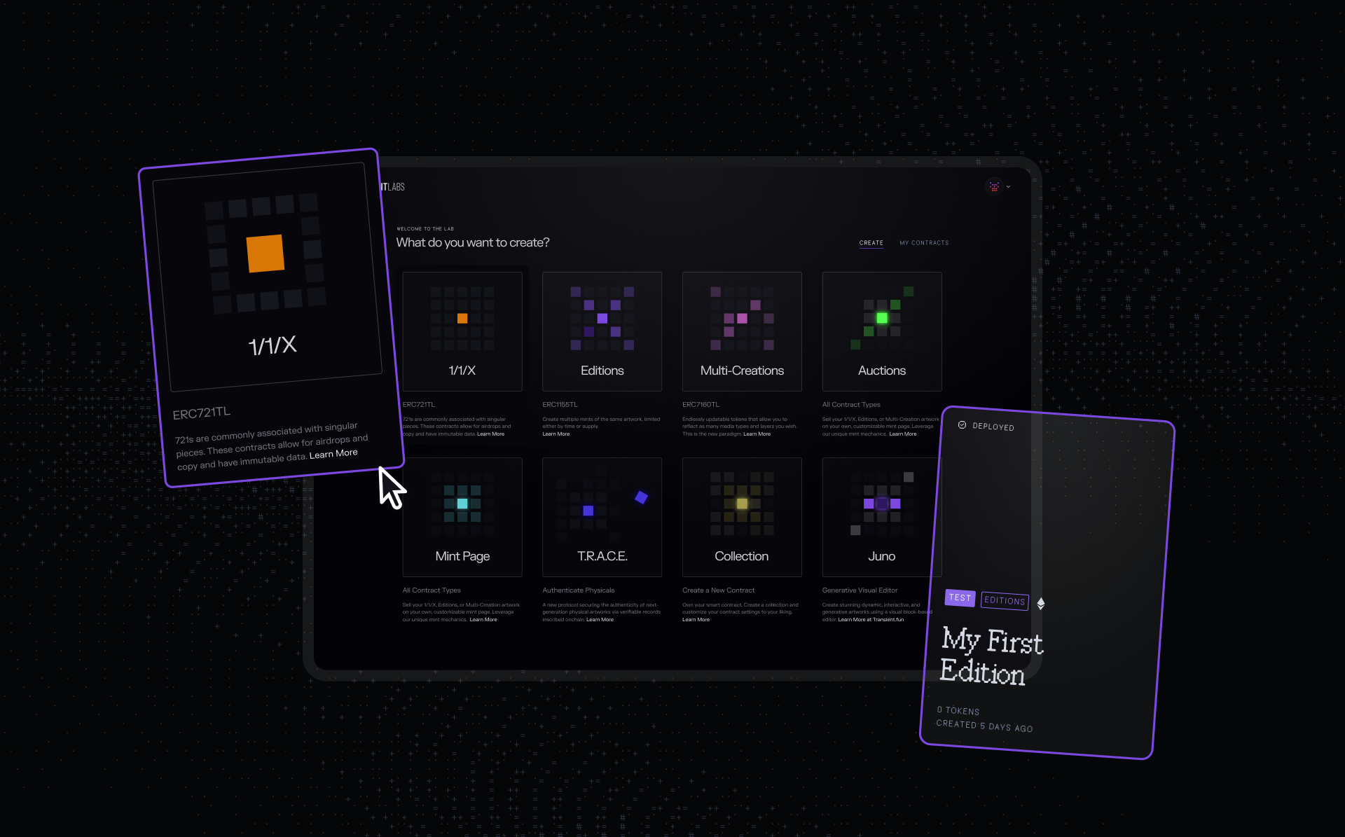
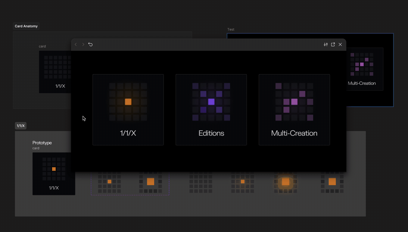
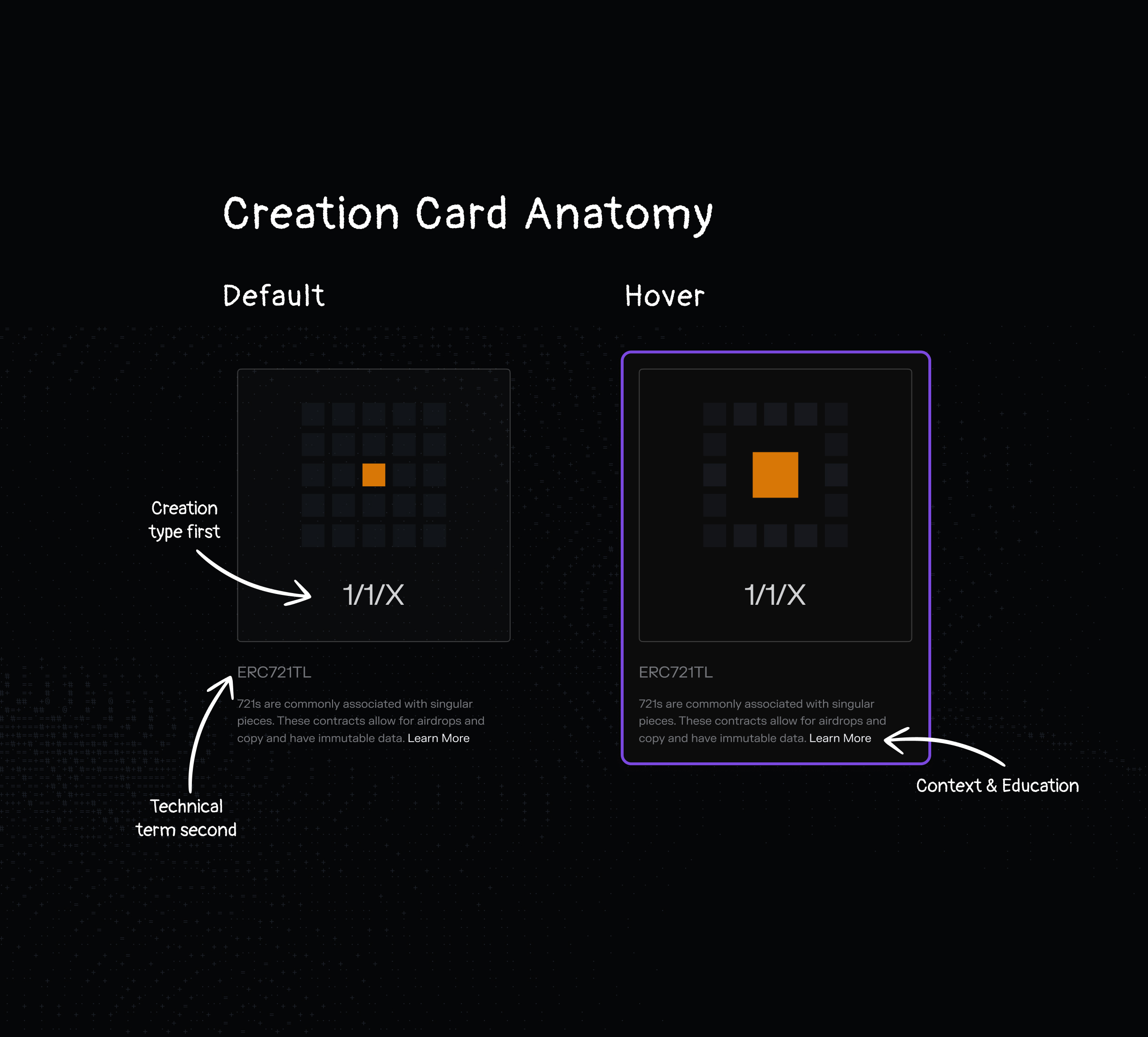
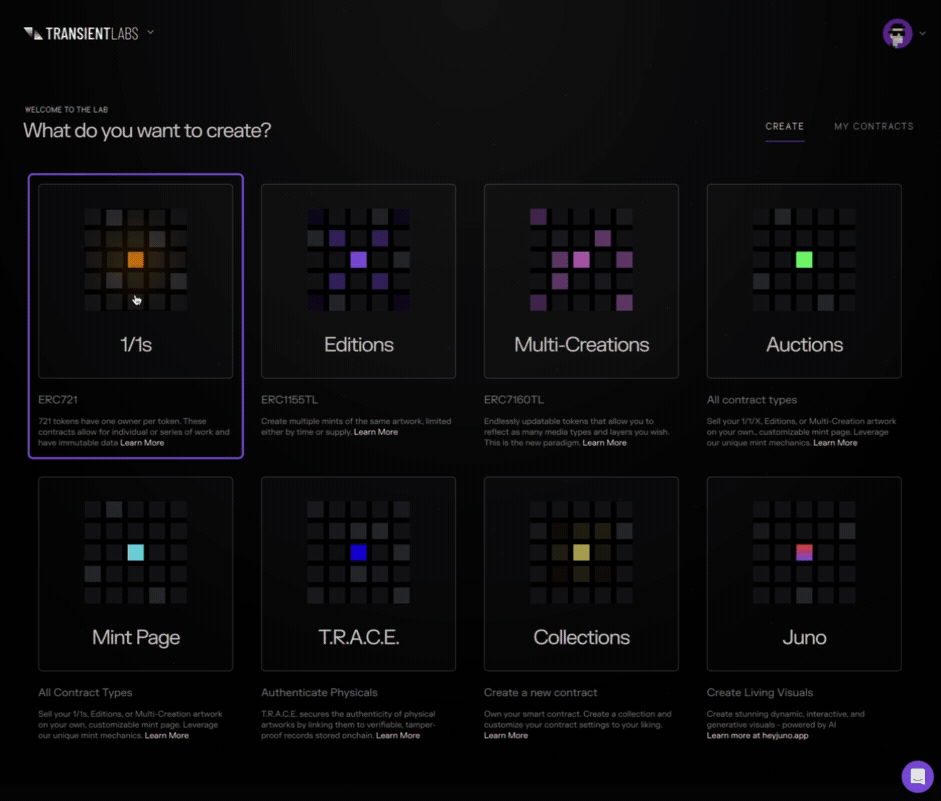
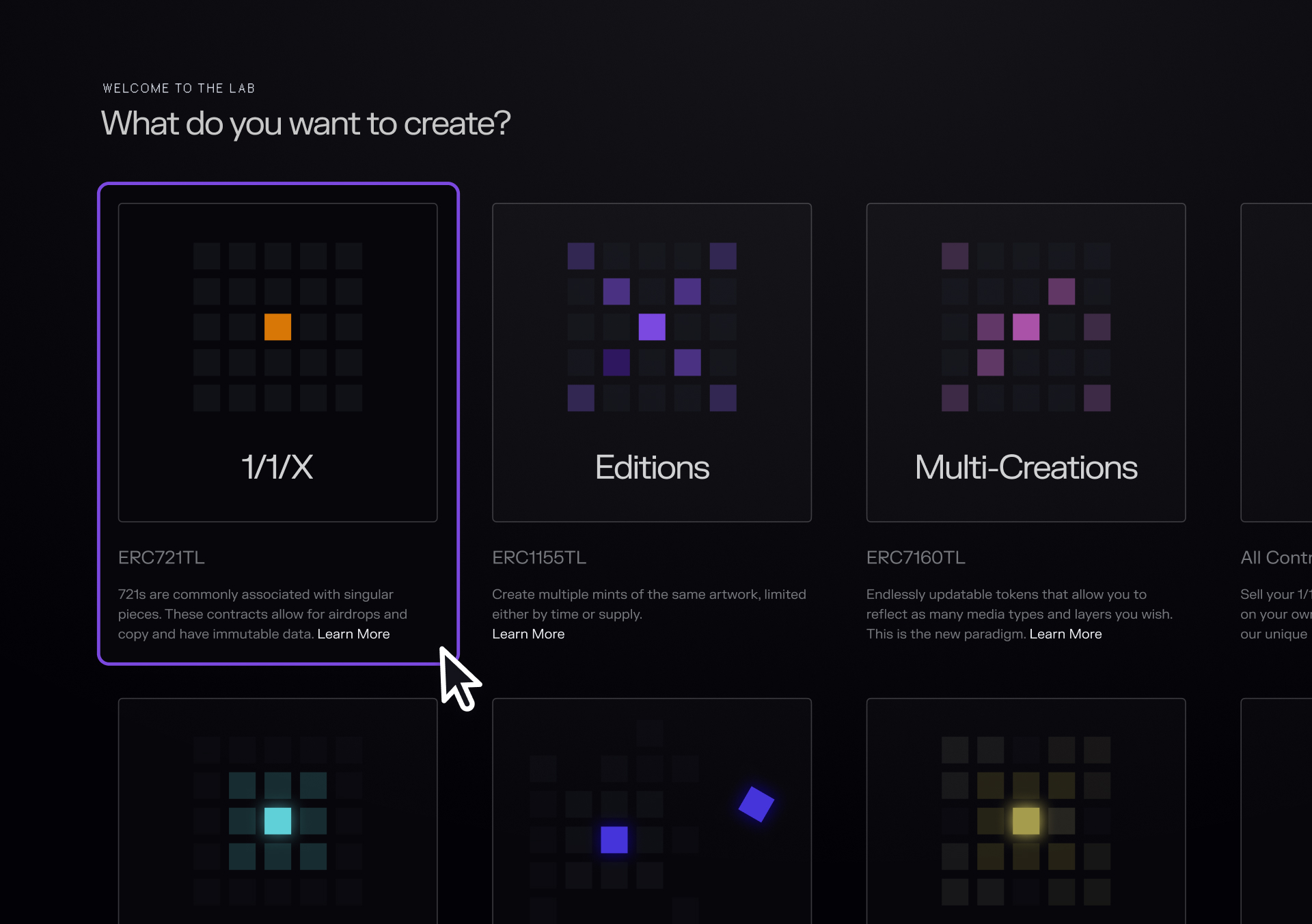
Elevating Contract Types Through Visual and Motion Design
In the first version of The Lab, contract selection was hidden in a dropdown field within a form... technical, text-heavy, and uninspiring.
Each contract type (1/1/X, Editions, Multi-Creations, and others) offered unique capabilities for artists to create, distribute, and sell art on-chain, but none of that richness was visible. They all looked and felt the same.
Each contract represented a creative pathway, so I set out to better surface them in the interface and give them visual identities of their own.
I designed distinct icons and cards for every contract type, pairing each with a concise description and a link to a help article or real-world example.
The goal was to make exploration more visual, more educational, and far less intimidating.

While these early prototypes helped establish motion direction, I ultimately shifted to Rive for the final animations.
Rive’s lightweight, state-machine embeds allowed each animation to run natively in the product with smooth, high-quality motion and interactive states all within a small, performant file size ideal for a web-based experience.
These new illustrations evolved into new cards that could house additional information, context and education for each contract type.
Smart Contract UX Explorations
Early explorations focused on reimagining how artists first interact with smart contracts.

Exploration: This carousel layout surfaced all available contract types visually, allowing artists to see what they could create -- editions, collections, dynamic pieces, and more. Each tile acted as a gateway into a distinct creative pathway, with clear labels and motion-driven feedback using Rive. The goal was to make contract selection feel intuitive and inspiring, not technical.
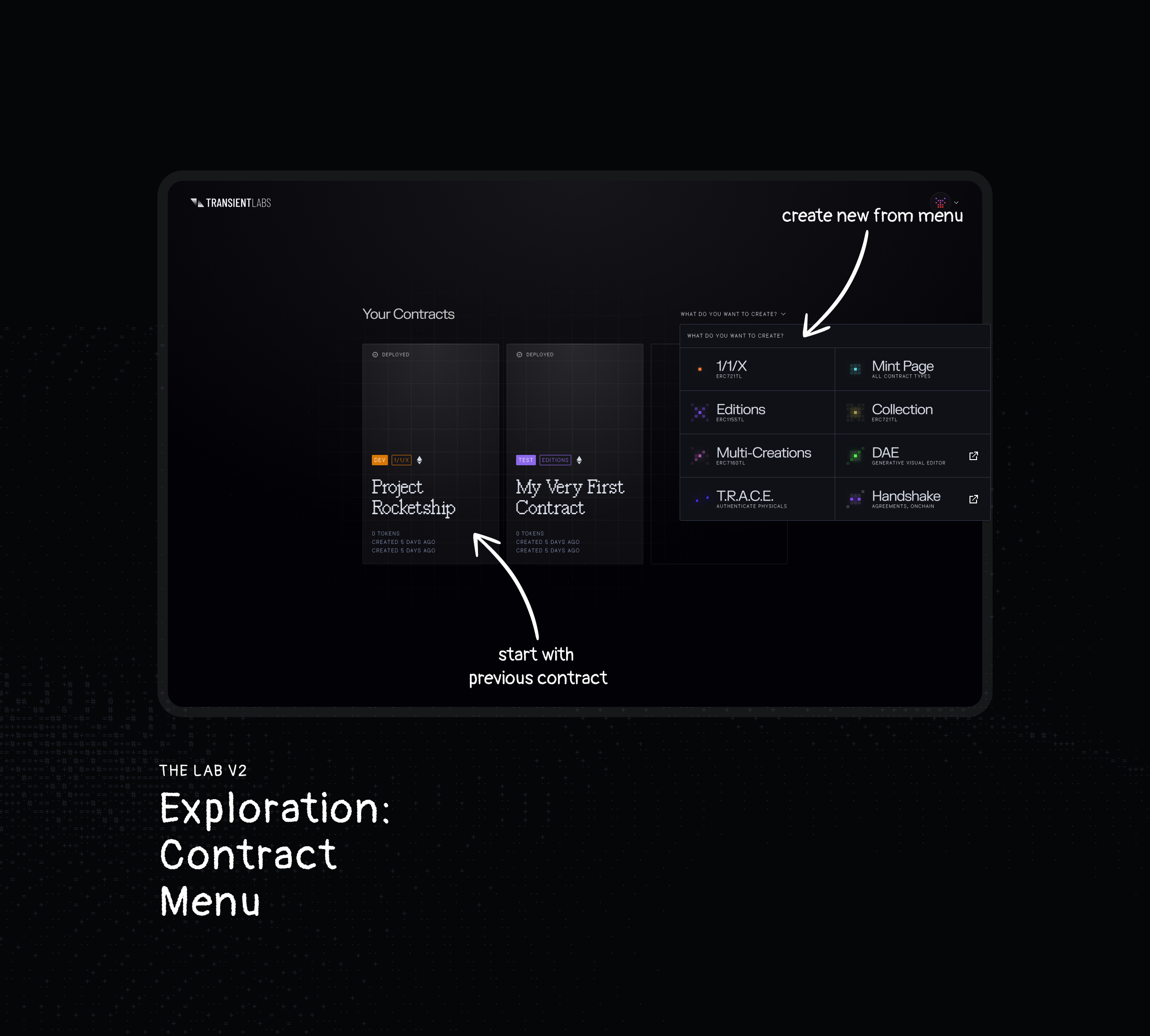
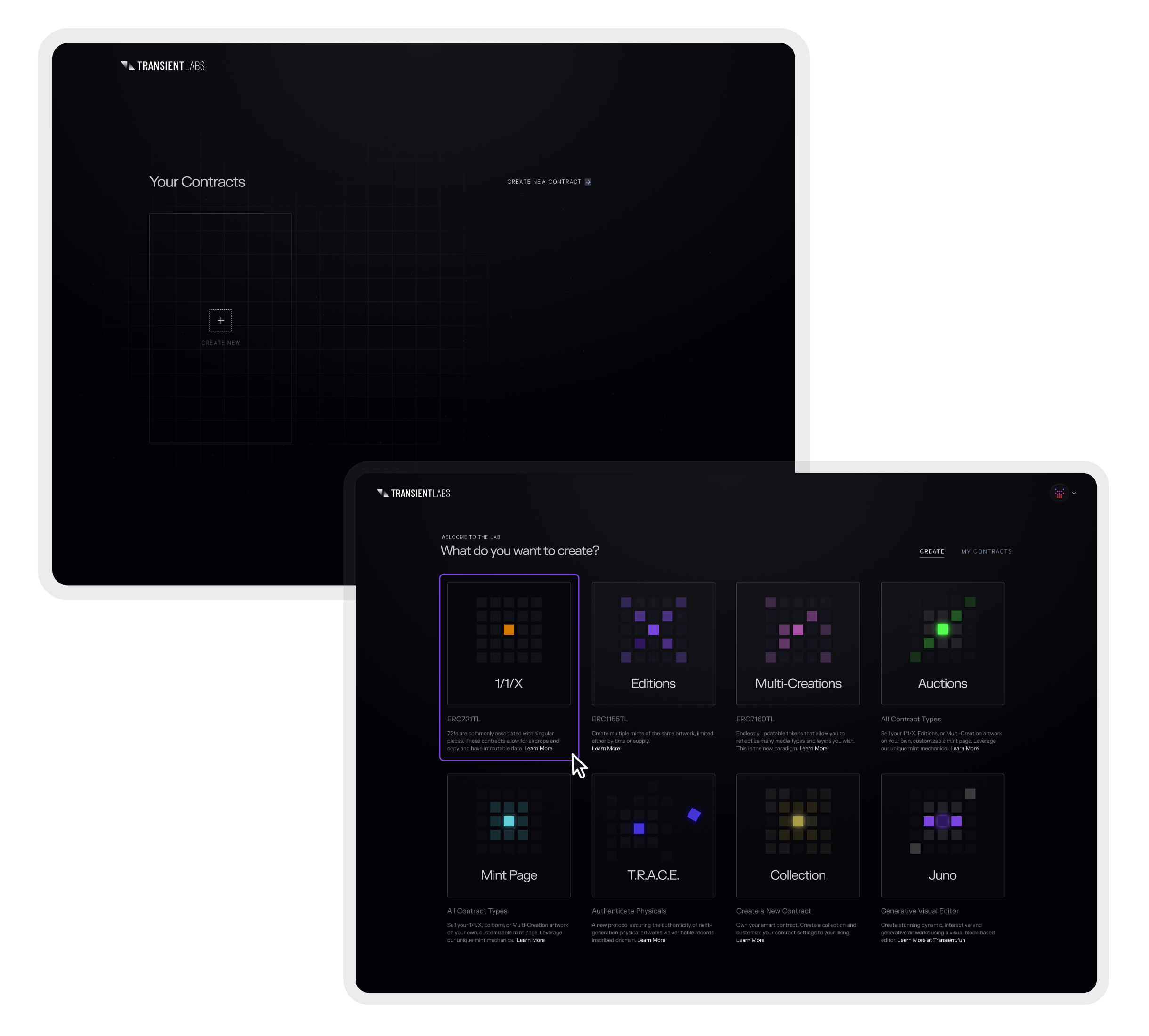
Exploration: This menu concept introduced a dual-panel layout -- on the left, deployed contracts from past projects; on the right, quick actions to create new ones. By surfacing previous work up front, artists could continue existing series or spin up new drops without starting from scratch, improving efficiency and re-engagement.
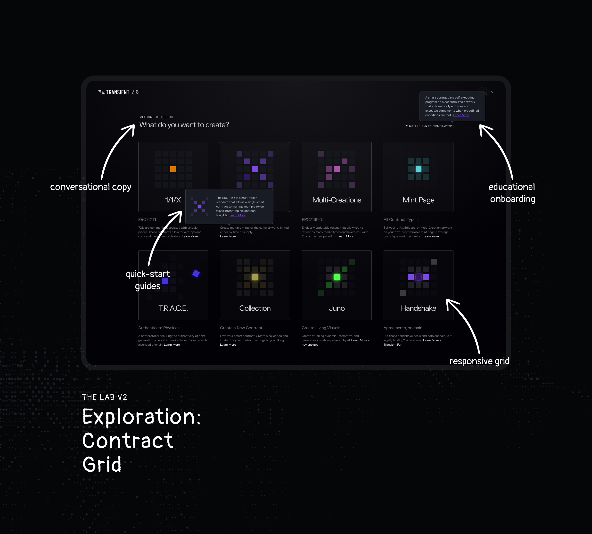
Exploration: After testing multiple approaches with our team and artists on the platform, this concept became the foundation for the new Lab experience.
It introduced conversational copy, quick-start guides, and educational tooltips directly in the interface... helping artists understand what each contract does without leaving the page.
This balance of clarity and creative energy made onboarding smoother and more empowering, transforming The Lab into a self-guided, educational workspace for both new and returning users.
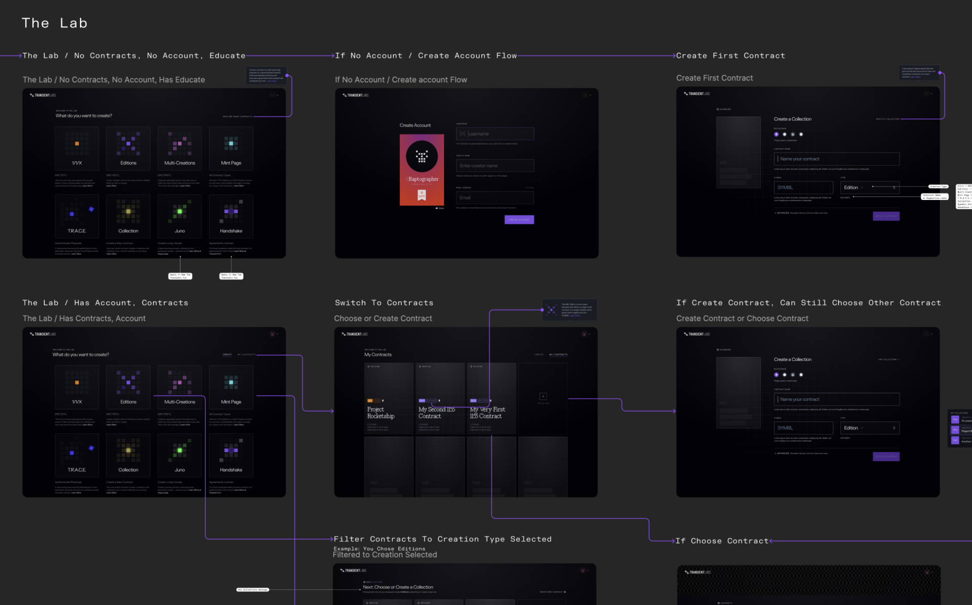
Mapping Every Path to Creation
To design a smoother creation experience for both new and returning users, I mapped every possible pathway an artist might take when setting up a contract.
Starting in FigJam, I explored decision trees for each contract type, showing how users might choose to start fresh or build on existing collections. This helped identify where friction existed in the flow and where we could reuse context from past activity.
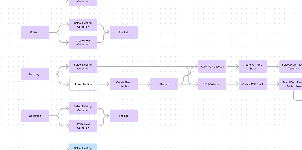
I then translated these explorations into detailed Figma user flows, collaborating closely with our engineering team to align on logic, edge cases, and system behavior.
The result was a more flexible creation journey that adapted to user intent, whether they were deploying their first contract or returning to expand their body of work.
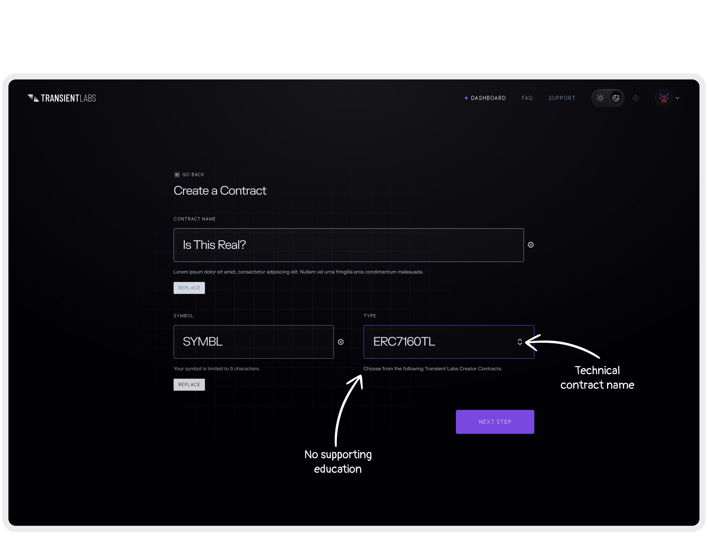
Guided by Context, Not Complexity
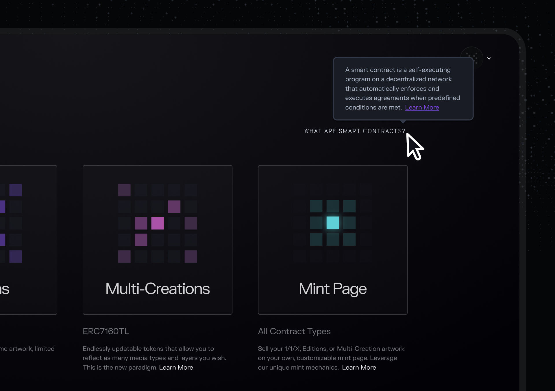
To make The Lab more accessible for first-time users, I designed lightweight educational tips directly into the interface. These contextual tooltips explained blockchain concepts, contract types, and minting terminology right where users encountered them, reducing friction without overwhelming the experience.
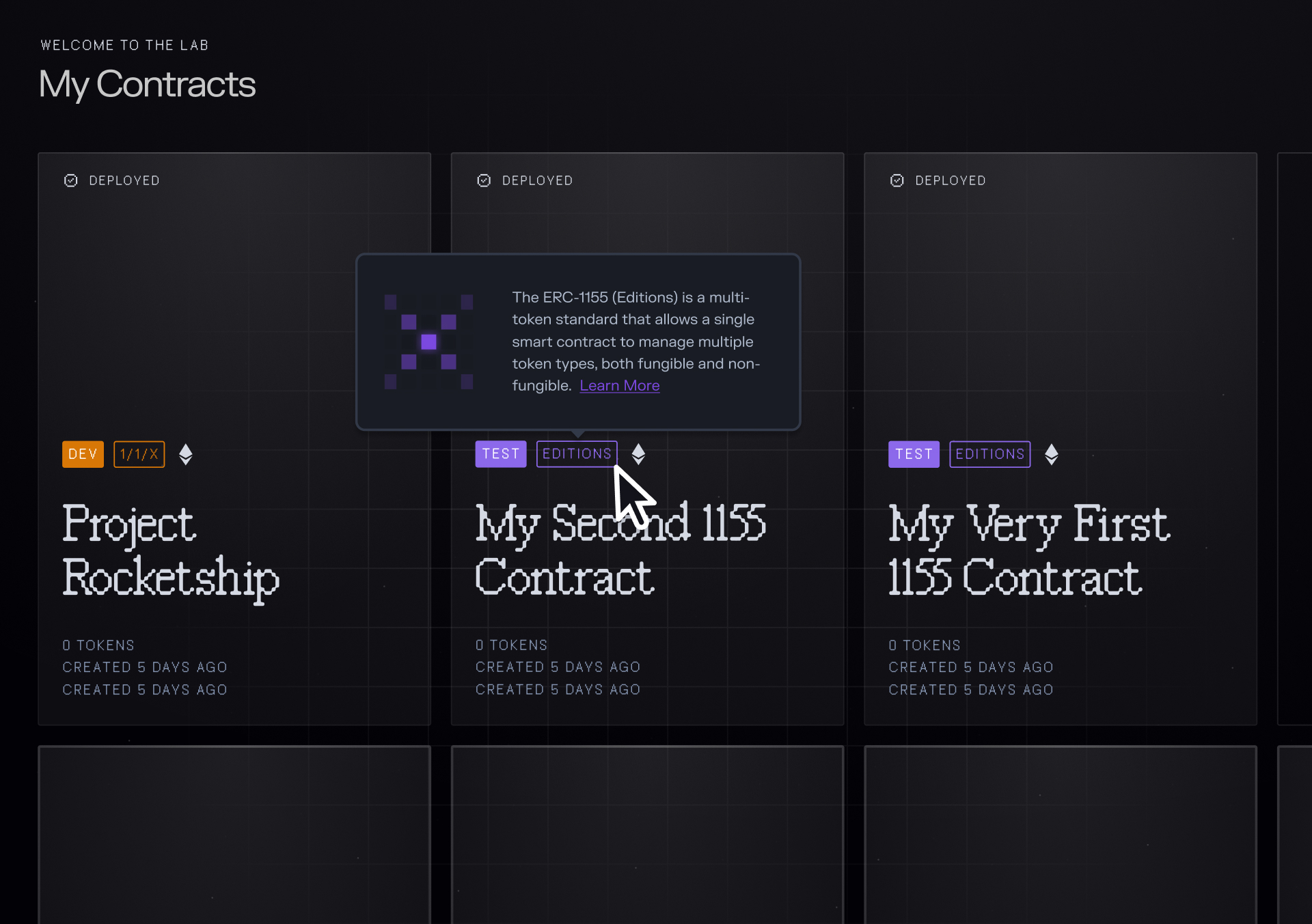
Each tip included a short, plain-language explanation and a link to a deeper help article, allowing artists to learn at their own pace. This approach turned onboarding into an in-product learning moment rather than a separate tutorial, helping users gain confidence as they explored.
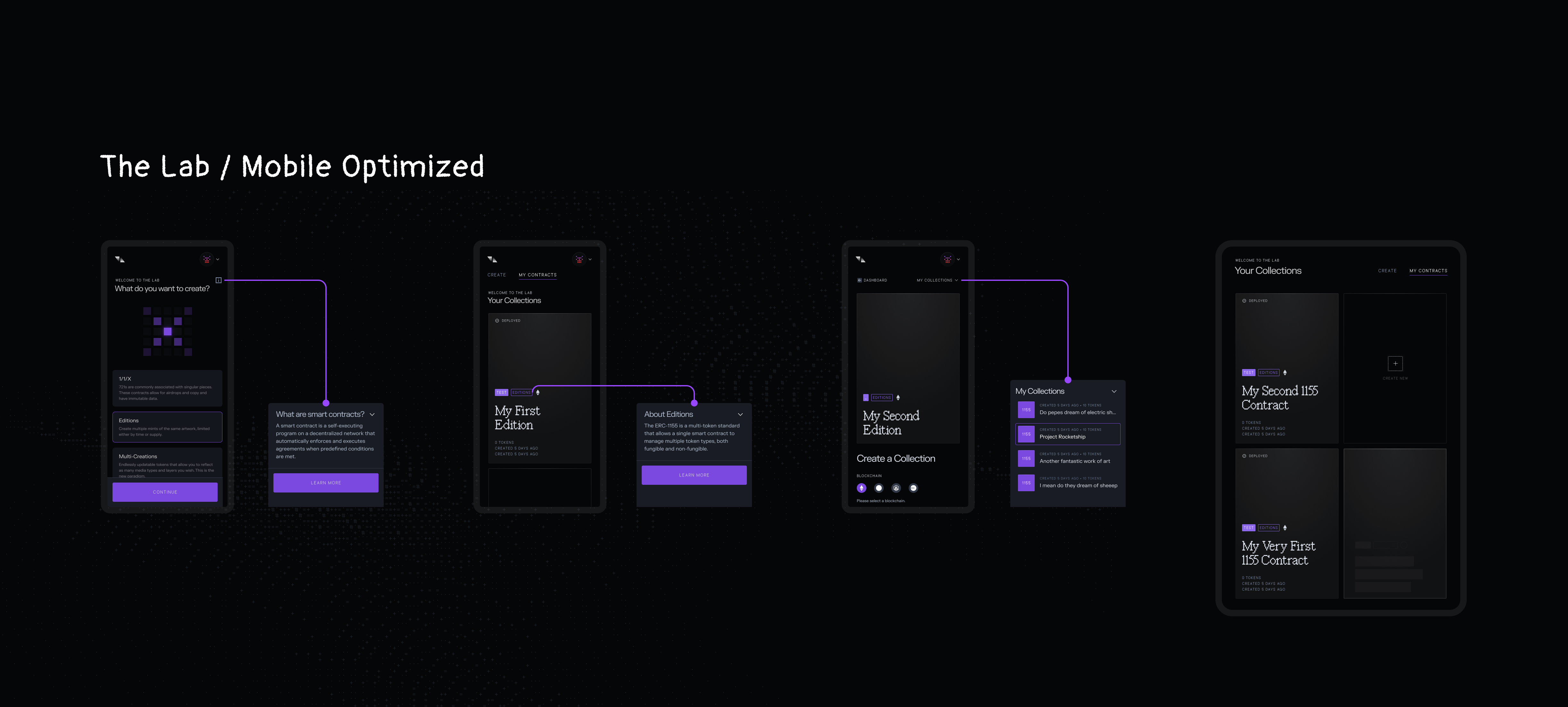
Designing for Every Screen
To make The Lab fully accessible to artists creating on the go, I optimized the experience for smaller and mobile screens. I restructured layouts using a flexible grid system and introduced mobile-friendly components like bottom sheets, drawers, and condensed cards to maintain clarity and flow. Each interaction—from selecting a contract to deploying a collection—was reimagined for touch, ensuring that the product felt just as intuitive and expressive on a phone or tablet as it did on desktop.
A more intuitive and inspiring Lab
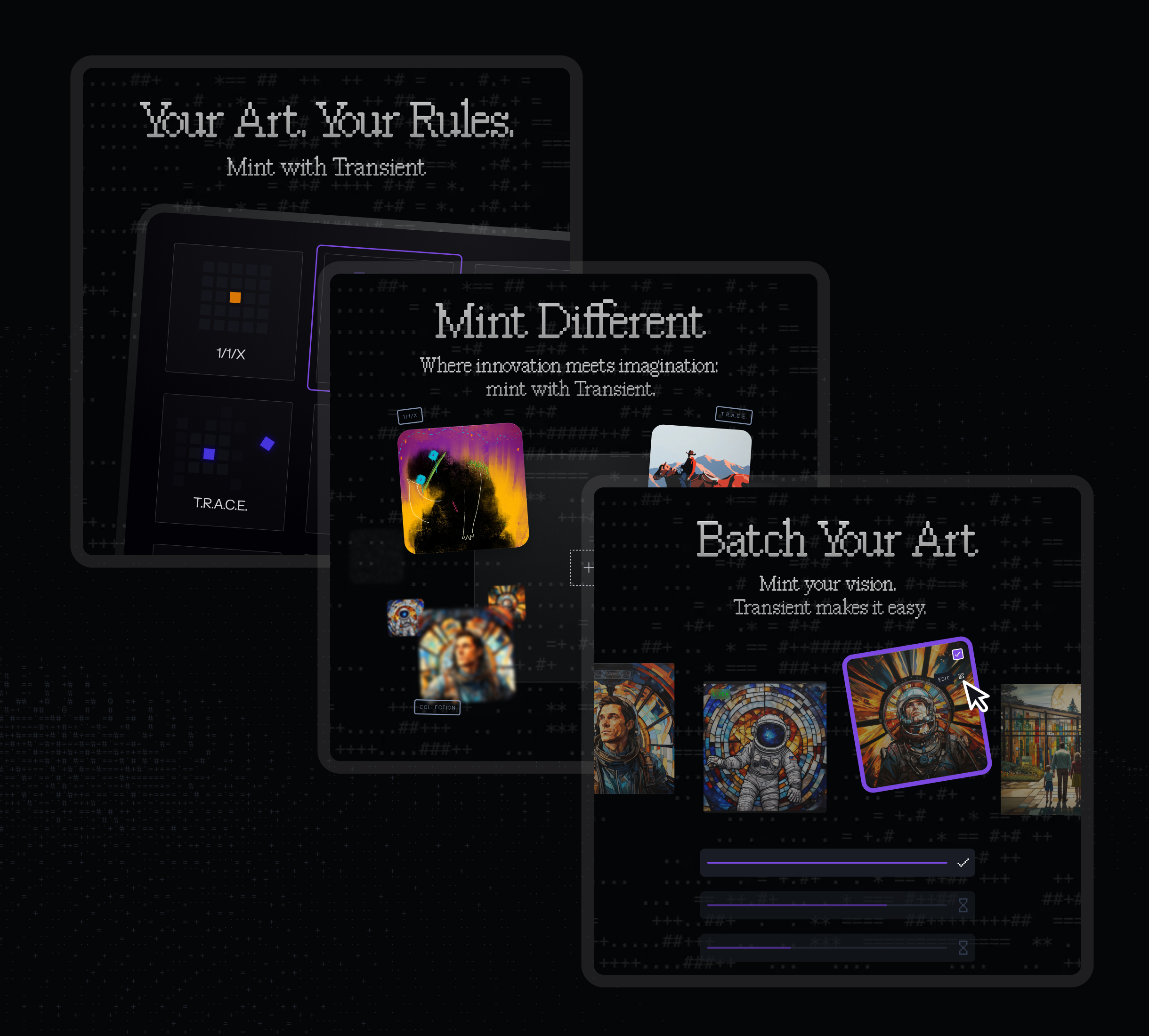
I redesigned the Lab’s homepage as a visual grid of animated “contract tiles,” giving each contract a sense of life through Rive animations.
- First-time users saw helpful explanations, educational links, and guided steps for minting and distribution.
- Returning users could view past mints, continue series, or launch new contracts directly from their existing ones.
- The entire experience was rebuilt for mobile, simplifying actions and improving load times.
The result was a dynamic, colorful landscape of possibilities that invited artists to explore what was once a hidden list of options. By turning a static form into a motion-driven gallery, The Lab began to feel like a true studio for digital creation.
Post Launch Results
- +40% increase in completed contract setups (beta)
- Significant reduction in duplicate contract creation
- Mobile engagement up and bounce rates down during artist testing
- Artists described it as “finally feeling like a studio, not a control panel.”
Launch & Promotion
We launched the redesigned Lab with a coordinated marketing campaign across email, social, and paid media. The campaign spotlighted each contract type through short, animated clips and educational posts, showing artists how to create, mint, and distribute their work on-chain in new ways. We ran targeted ads on Twitter to highlight improvements like simplified onboarding and the new Bulk Uploads feature, driving both awareness and re-engagement from existing artists. The result was a noticeable uptick in traffic, contract creation, and conversation across the Transient community.
United Masters Wallet
